Monthly Archives: March 2019

Community Scene

First, an apology

Well, I ended the first post of my new blog rather abruptly. I didn’t say good luck, good bye, or anything to let you know I was finished. I just quit. Sorry about that. I’ll try to do better from now on.

Wow, do I feel stupid.

Step by Step

  • This next 2-page spread is easy to do; it’s a painted background with stenciling and a few words of hand-printed text.
  • I painted the backgrounds of both pages to resemble a landscape. I used London Blue, and Vibrant Turquoise in the sky area, and Lime Green in the center third of the pages, and Chopped Pesto on the bottom third, all Dylusions Paints.
  • In the sky area I used White Linen on portions of Stencil Girl Stencil L568 .
  • Along the bottom third I stenciled a mixed grayish brown of Melted Chocolate with a touch of gray, using a stone wall stencil TCW 191S. TCW stands for The Crafter’s Workshop.
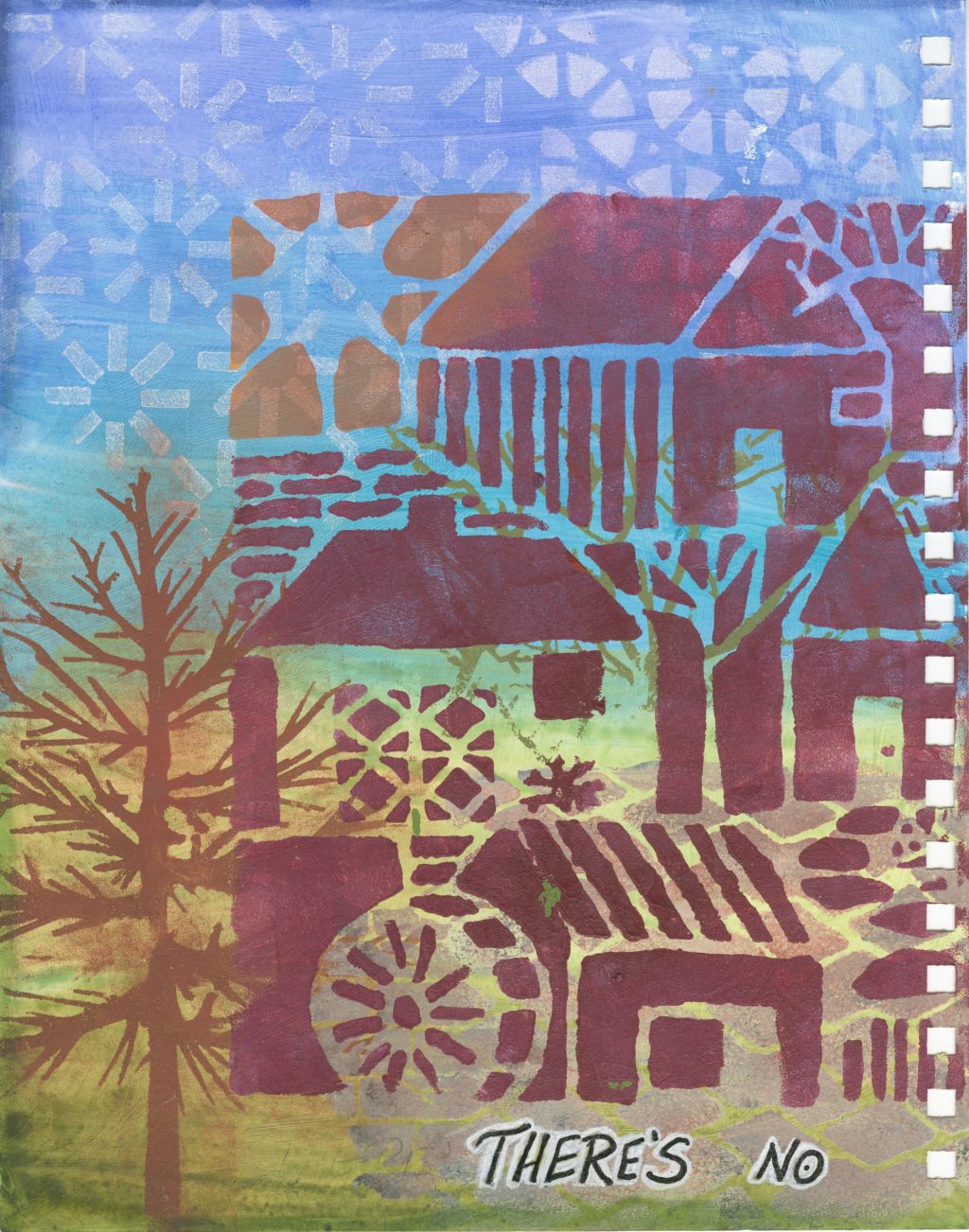
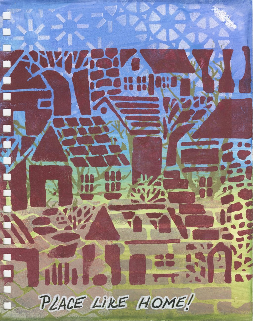
  • On the left side of the left page I stenciled a bare-branched tree with VersaMark and colored it with a brown Pan Pastel color. There are no markings on the stencil so I cannot tell you who made it.
  • In the middle third I stenciled several trees with a light brown using TCW 251S stencil.
  • The large stencil of the houses is STS (Stencil Girl Stencil) L444. It is not large enough to cover the width of both pages so I repeated an area in the middle to get it the size I wanted.
  • The words, “There’s No Place Like Home”, are hand printed with a Fude Ball Pen and outlined with a white Posca Pen to make them stand out.
  • After it is all completely dry I used a Pitt pen to paint a narrow band around one edge at a time then smeared it with my finger before it dried to get a smooth and faded edge. I did this only on the top, bottom, and outside edges.
  • Now you are finished.

Quote

I have no special talents, I am just passionately curious. Albert Einstein

Mixed Media Art Journal

Mixed Media for art journaling is what I have been teaching and I feel it would be good to have written instructions along with photos to inspire you to try some things you may not have tried.

  • Most of the mixed media I do is in my art journals. I like to work in a Canson Mixed Media 7″ by 10″, 60-page sheet, wire-bound book for several reasons. The paper is bright white with just enough texture to make it easy to use several different kinds of inks, paints, markers, pens, and pencils.
  • The paper weight is heavy enough, 98 pound or 160 g, to work well with different paints and light weight enough to allow me to glue two pages back to back which I do in my journals; and it is also a good weight for a card front to glue to a card stock base.
  • The total size of one sheet is 7 3/4 inches wide by 10 inches tall with a vertical perforation. The added margin width of 3/4 inch is where the paper is bound by the wire coil. If you tear the paper at the perforation you get a sheet that is 7″ by 10″ which when cut in half crosswise gives you two 5″ by 7″ pieces for card fronts. The perforation is so well made that you hardly notice it and it holds up through all the punishment it receives by the added water, paints, inks, etc.
  • Because of the way it is bound I can easily pull the coils apart just enough to take out individual sheets. This allows me freedom to move the sheet around as I do my art work. It’s much easier to do stenciling when you have a single sheet rather than a page bound into a book. I don’t have to worry about getting paint onto a page beneath the one I am working on because it’s a single sheet. With this wire coil I can easily reassemble all the pages together and close up the coils when all my pages are finished.
  • For my journals I work on what I call a 2-page spread with the two sheets facing each other as they would if you were flipping through the book.

Two pages, facing, showing the punched holes for the wire coils.
  • Here are instructions for a 2-page spread I recently taught in a class.
  • Both backgrounds are painted with Dylusions Paints in these colors; Laidback Lilac, Calypso Teal, Crushed Grape.
  • The left page is painted with watered down paints to make a more pastel version. The right page is painted with less watered down paints to give more saturated color because a coat of iridescent medium will be painted on top of this painted background.
  • The left page has a geometric design stenciled in the upper left corner in Crushed Grape.


  • I used Stampendous “Hummingbirds” to die cut two hummingbirds from painted deli paper I had done on my Gelli Plate. I also die cut a larger bird with another Stampendous die, “Bird Blossom”, from the same sheet of Gelli printed deli paper.
  • I stamped and “fussy” cut the vine with flowers from Stampendous “Hummingbirds”, then painted it with watered down acrylic paints for a light pastel look.
  • I glued all the images, 3 birds and the vine to the page.
  • In the bottom right, I stamped in Garden Patina Archival Ink a Penny Black stamp named “Dainty and Delicate”.
  • Over this I stamped a quote in Cobalt Blue Archival Ink with a stamp by Impression Obsession.
  • I outlined the 3 birds with a white Posca Pen and the leaves and flowers with coordinating colors using Dylusions Paint Pens.
  • On the right page, I coated the entire page with Liquitex Iridescent Acrylic Medium to give it a pearlescent shine which is beautiful but doesn’t show up in photos or on the computer.
  • While this iridescent medium was still wet I randomly curled a length of beautiful metallic turquoise thread by Madeira, Glamour 2466 and added more medium over top of the thread to secure it in place.
  • When dry, I stenciled the leaf stencil “Fronds of Foliage” by Dylusions in paint colors Crushed Grape, Calypso Teal, Mushy peas, and Dirty Martini by Dylusions.
  • When this was dry I outlined the leaves with companion colors of Dylusions Paint Pens.